What should be considered when designing a sustainability report?
- 3 days ago
- 5 min read
In recent years, sustainability reports have evolved from being mere documents where companies share their environmental and social performance to becoming one of the most important tools of corporate communication. Investors, customers, employees, suppliers, and regulatory bodies, in particular, closely examine these reports to evaluate companies' sustainability approach.

However, simply gathering comprehensive data and creating strong content is not enough to produce a successful sustainability report. How the content is presented, how the information is organized, and how effectively visual language is used also directly affect the report's success.
A well-designed sustainability report not only conveys information; it also reflects a company's professionalism, transparency, and approach to sustainability.
The Impact of Sustainability Reports on Corporate Reputation
Corporate reputation today is not shaped solely by financial performance. Stakeholders now also evaluate companies' environmental impact, their approach to employees, their ethical management practices, and their social contributions.
Sustainability reports have become one of the most important sources for this assessment.
However strong the content of a report may be, a complex, difficult-to-read, or visually weak document may not create the intended impact. First impressions are often formed by design.
A professional design;
It builds corporate trust.
It strengthens the perception of transparency,
It supports investor relations,
It contributes to brand value.
It makes the company's sustainability efforts more visible.
Especially in companies working with international investors, report design is no longer just an aesthetic preference, but a strategic part of corporate communication.
The Contribution of Design to Readability
Many sustainability reports range in length from 100 to 300 pages. Maintaining the reader's interest in such a comprehensive document is extremely important.
Good design allows the reader to access information more quickly.
The key elements that improve readability are:
Clear heading structure
Regular page flow
Suitable line lengths
Choosing the right typography.
Sufficient use of white space.
Balance between visuals and text.
The success of a report's design should be measured not only by how aesthetically pleasing it looks, but also by how easily the reader can access the information they need.
Information Hierarchy in GRI and TSRS Compliant Reports
Reports prepared under GRI (Global Reporting Initiative) and TSRS (Turkish Sustainability Reporting Standards) generally contain a large amount of data.
Therefore, establishing the correct hierarchy of information is of great importance.
The reader can find the following in the report:
To the company profile,
Regarding the management approach,
ESG performance,
Towards the goals,
GRI or TSRS indexes
It should be easily accessible.
There should be a clear distinction between headings, subheadings, and content blocks. Investors and analysts, in particular, want quick access to specific data. Presenting information in a disorganized manner can reduce the report's usability.
In a successful sustainability report, the reader doesn't get lost between the pages. The design guides them.
How to Simplify Data-Intensive Pages?
One of the biggest problems encountered in sustainability reports is the sheer volume of data.
Dozens of different indicators, such as carbon emissions, energy consumption, water usage, waste management, and occupational health and safety performance, are included in the same report.
Presenting this data only in tabular form may tire the reader.
To simplify data-intensive pages:
The data should be categorized.
A visual hierarchy should be established.
Key indicators should be highlighted.
Long charts should be reinforced with supporting graphs.
Breathing space should be left within the page.
The goal is not to reduce data, but to make it more understandable.
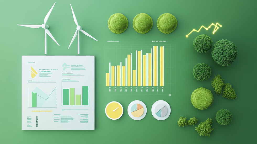
Use of Graphics and Infographics
Data visualization is one of the most important elements of modern sustainability reports.
Well-designed graphics and infographics enable readers to understand complex data in seconds.
For example:
Changes in carbon emissions are shown with line graphs.
The distribution of energy resources is shown with pie charts.
Water consumption performance is shown with bar graphs.
ESG strategies with infographics.
It can be presented in a much more effective way.
However, when using graphics, overly complex designs should be avoided. The faster a graphic is understood, the more successful it is.
Infographics are particularly effective tools for explaining sustainability strategies, value chains, and areas of impact.
Integration of Corporate Colors into the Report
The sustainability report is an extension of the company's brand identity.
Therefore, the color palette, typography, and visual language used in the report should be consistent with the company's corporate identity.
Some reports use intense green tones simply because they evoke sustainability. However, this approach is not always correct.
The key is to maintain the theme of sustainability while reflecting the brand's own identity.
Correct use of corporate colors:
It ensures brand consistency.
It enhances a professional appearance.
The report strengthens corporate belonging.
When a reader opens the report, they should be able to sense which company it belongs to thanks to the design language.
The Digital PDF Experience
Today, most sustainability reports are read digitally.
Therefore, design should not be done solely with print output in mind.
For digital use:
Clickable table of contents.
Section links,
Easy navigation structure,
Landmarks,
Optimized file size
Features such as these should be planned.
User experience is especially important in reports exceeding 150 pages. A well-designed digital PDF encourages readers to spend more time with the report.
Readability on Mobile Devices
A significant portion of corporate reports are now viewed on tablets and smartphones.
Therefore, a design that looks good on a desktop needs to be readable on mobile devices as well.
In terms of mobile compatibility:
Very small font sizes should be avoided.
Complex tables should be simplified.
Readability should be maintained in the graphics.
Page layouts should be designed with digital screens in mind.
Mobile user experience will continue to be one of the most important criteria for sustainability report design in the future.
The Use of AI-Powered Visualizations
Artificial intelligence technologies have begun to play a significant role in design processes in recent years.
AI-powered visuals in sustainability reports;
In cover designs,
In concept presentations,
In the illustrations,
In data-supporting visual content
It is available for use.
However, using authentic photographs in areas that represent the company's actual operations is still the most reliable method.
AI-generated visuals can add creativity to design, but they shouldn't replace real photographs of things like manufacturing facilities, employees, or sustainability projects.
The most successful reports typically combine professional photography with AI-powered visualization solutions in a balanced way.
Lessons to be Learned from Successful Reports
When examining internationally award-winning sustainability reports, some common characteristics stand out.
These reports state:
A clean and minimalist design approach,
Powerful data visualization,
Use of high-quality photographs,
Consistent visual language,
Easy-to-read content structure,
Powerful digital experience
It stands out.
Successful reports guide the reader rather than overwhelming them with information. They make complex data understandable and support the company's sustainability story with effective visual storytelling.
Conclusion
Designing a sustainability report is not just an aesthetic project; it is also a strategic communication tool that accurately portrays a company's sustainability performance.
Establishing a proper information hierarchy, simplifying data-intensive pages, using strong graphics and infographics, reflecting corporate identity in the design, and incorporating professional photographs significantly enhance the report's impact.
Today, investors and stakeholders pay attention not only to the data itself, but also to how that data is presented. Therefore, the design of a sustainability report is as important as the content.
For information on professional sustainability report design, data visualization, AI-powered visual generation, and corporate photography services tailored to the report content, please contact Report Design.


Comments